Independent concept / Editorial layout
Field Notes
A fictional pocket publication: contrast a quiet reading rhythm with a strong opening spread.
The fictional brief
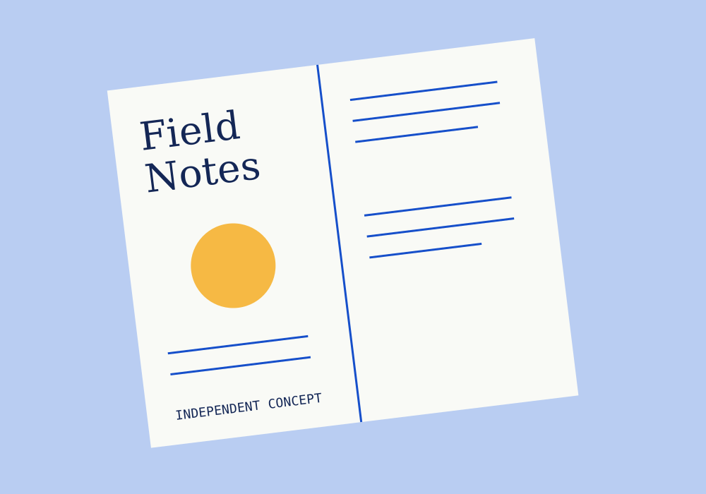
Design a pocket publication with an opening spread and a clear distinction between title, body and supporting notes. The sample title belongs only to this concept.
The visual decision
A strong serif title gives the spread a recognisable entry. The facing page uses shorter horizontal lines to suggest a quieter reading rhythm. The circle provides a pause without introducing a photograph or a fictional author.
From concept to production
A real booklet would need final text, page count, dimensions, paper and print specifications. This drawing is a visual study and is not presented as a printed publication.
Return to the work index